Sai Gon
Brand Identity - Typography
This is the final semester project for our Typography course. I had the opportunity to collaborate on this project with my talented peers, Khánh Nimal and Lyn Nguyễn, two outstanding designers from whom I have learned a great deal
We were required to do a project which must be relevant to our earlier assignment: Notable works of renowned type designer Adrian Frutiger. The project should be a demonstration of our skills and knowledge in typography, layout solution and basis element design.
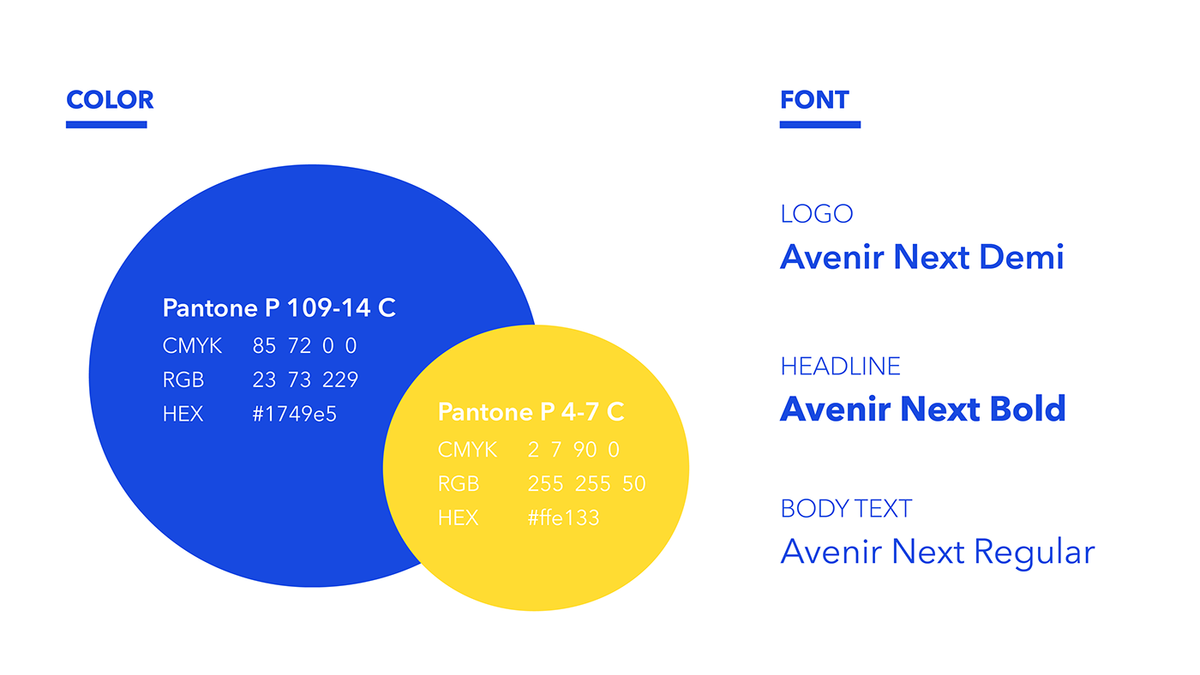
Since the swiss designer’s typefaces have distinctive characteristics which are clear, highly legible and popular, we decided to create identity using only his typefaces.
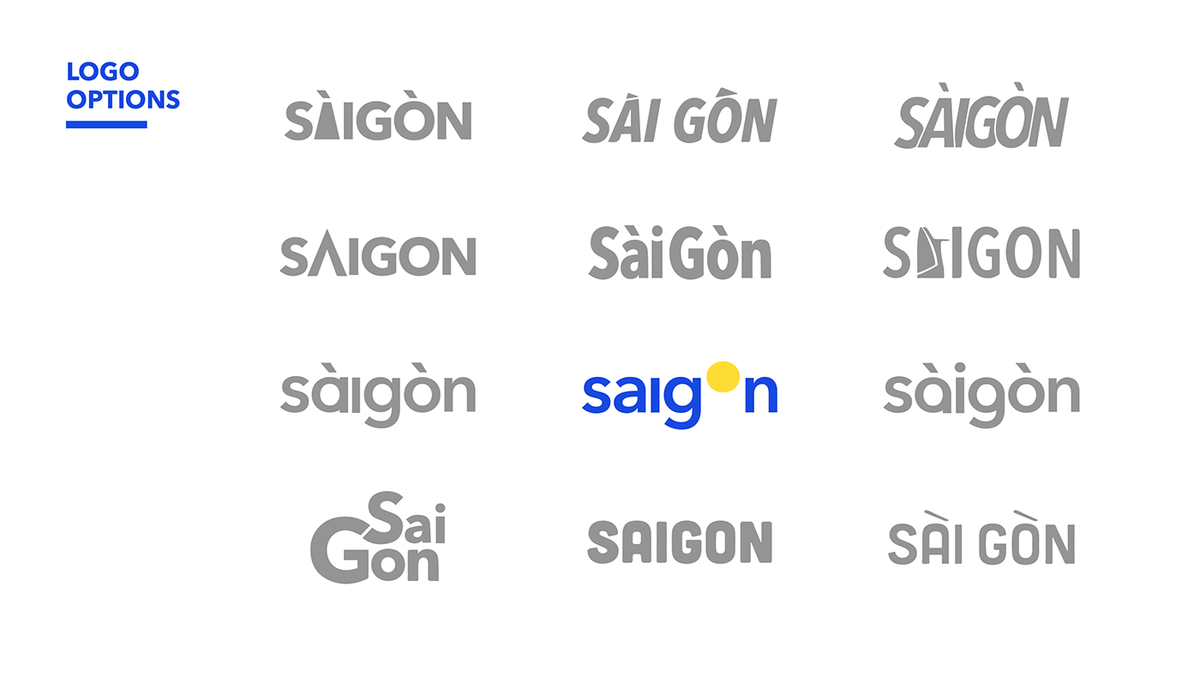
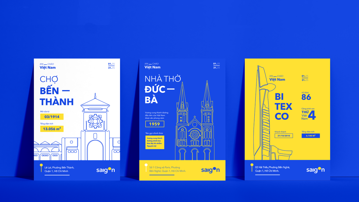
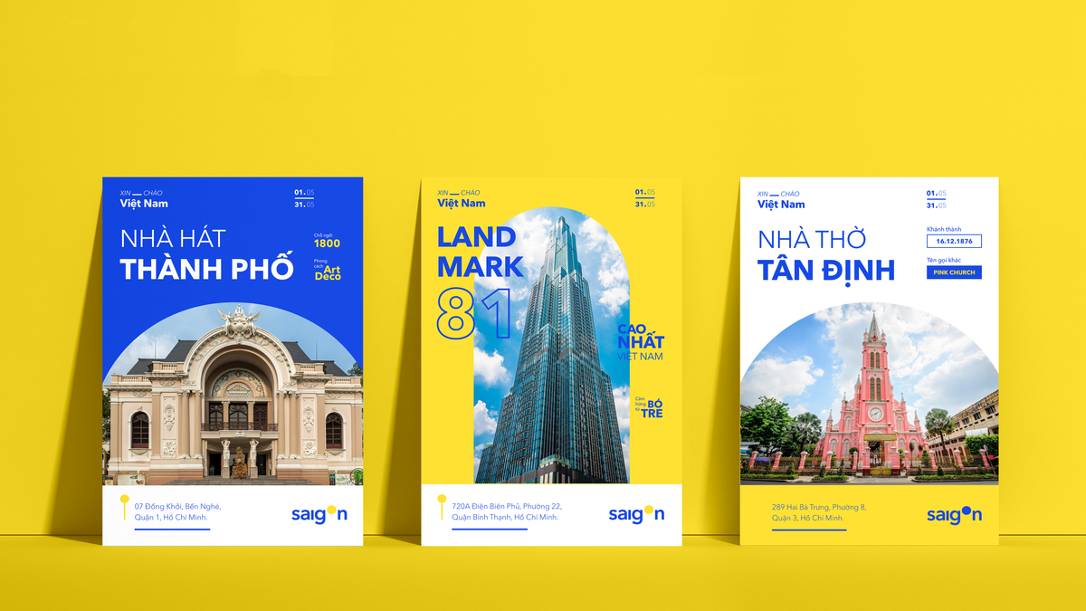
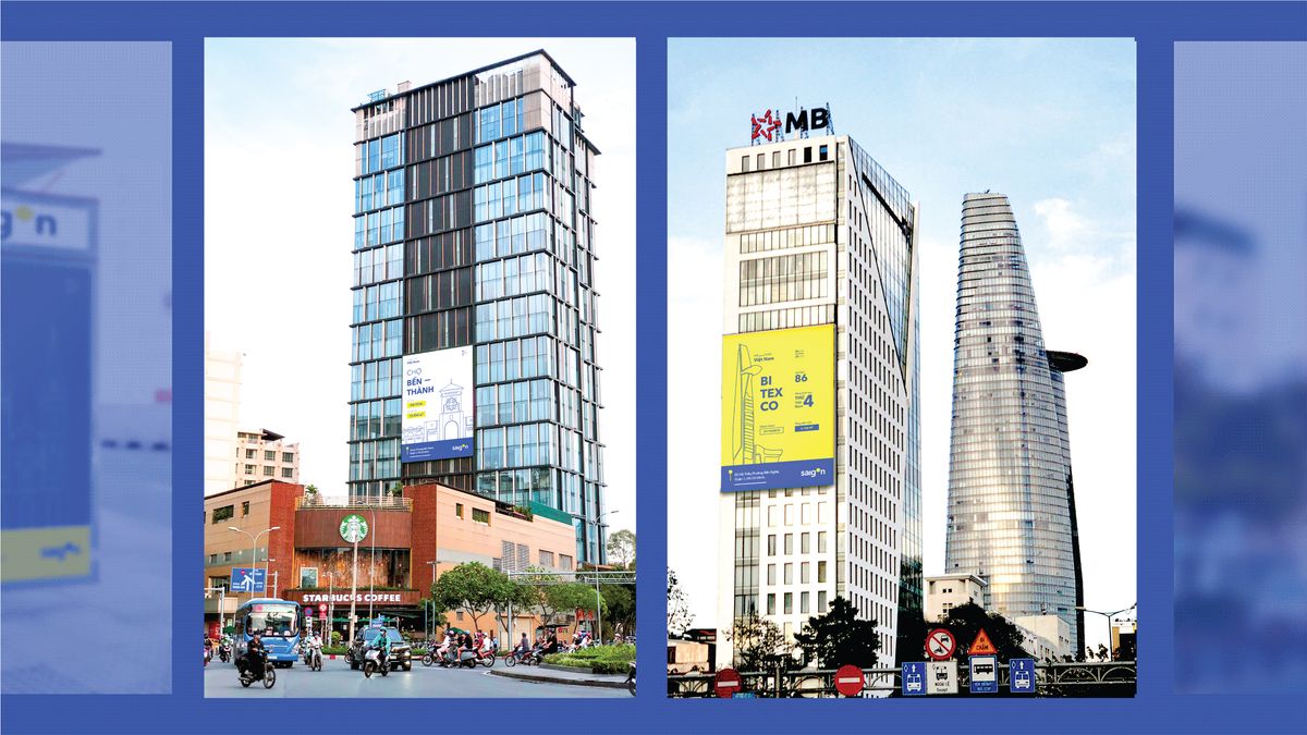
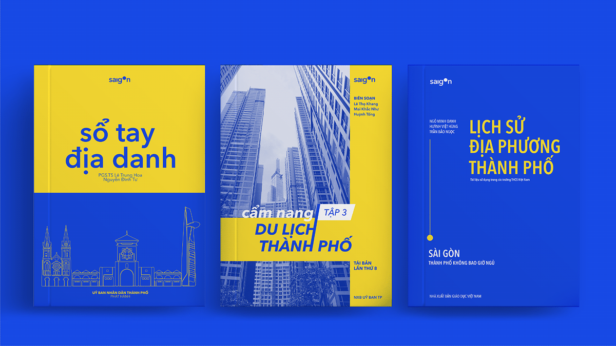
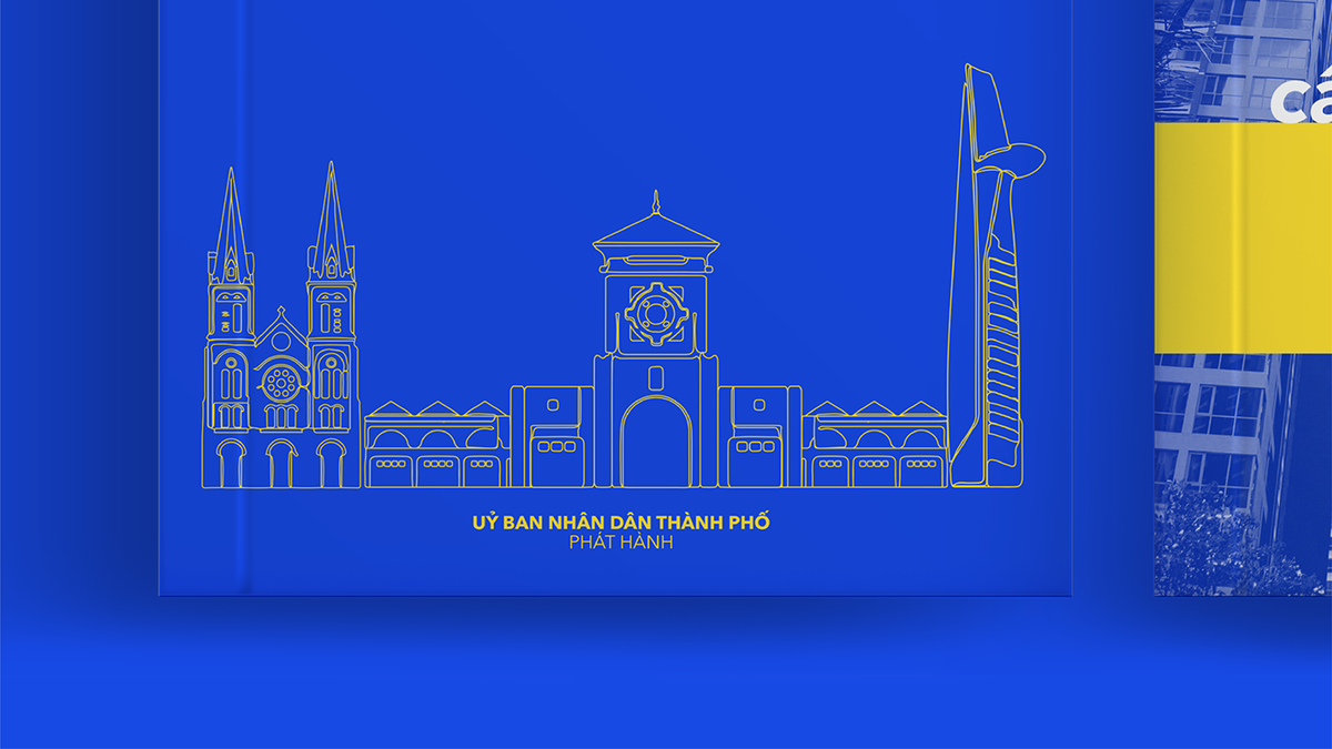
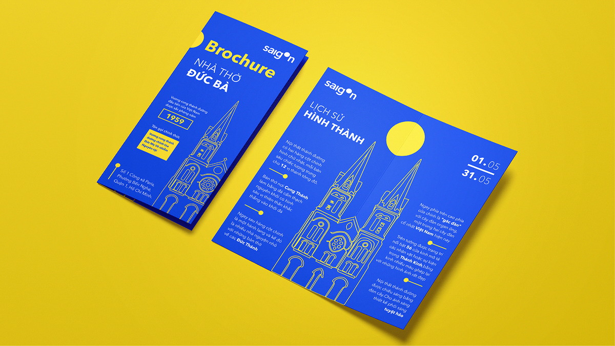
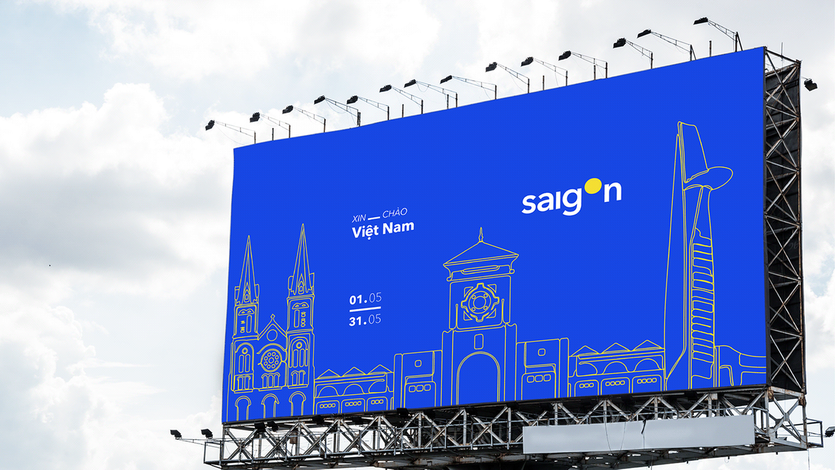
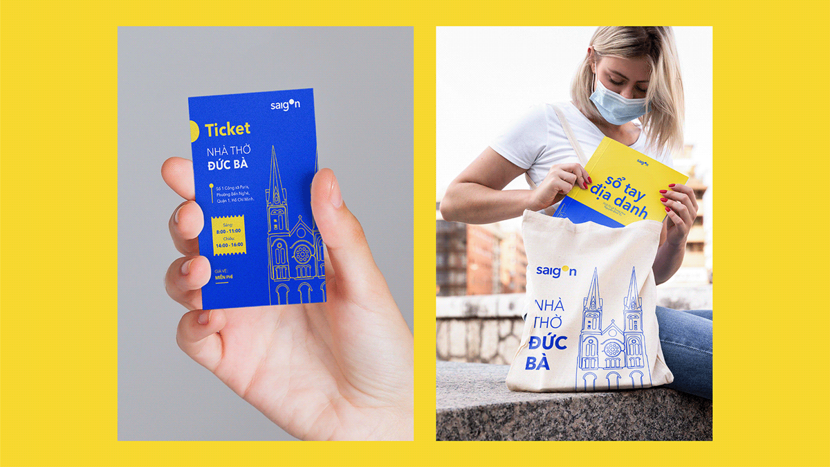
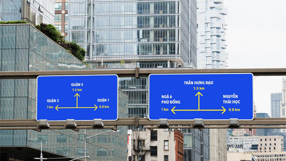
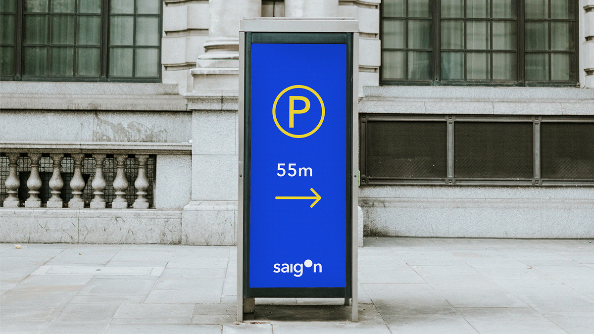
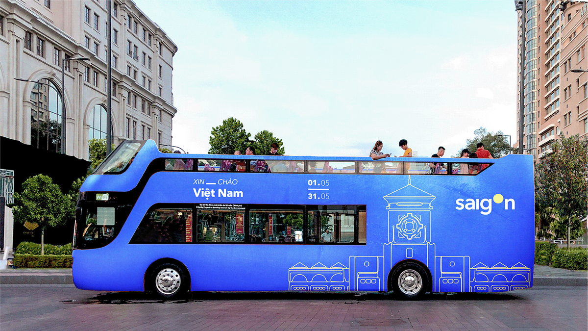
Starting with an optimal combination, our selection is Avenir typefaces and Saigon city. Saigon is the largest and busiest city in Vietnam. The typeface which represents this city needs to have a simple yet modern and clean look which perfectly matches Avenir’s characteristics.
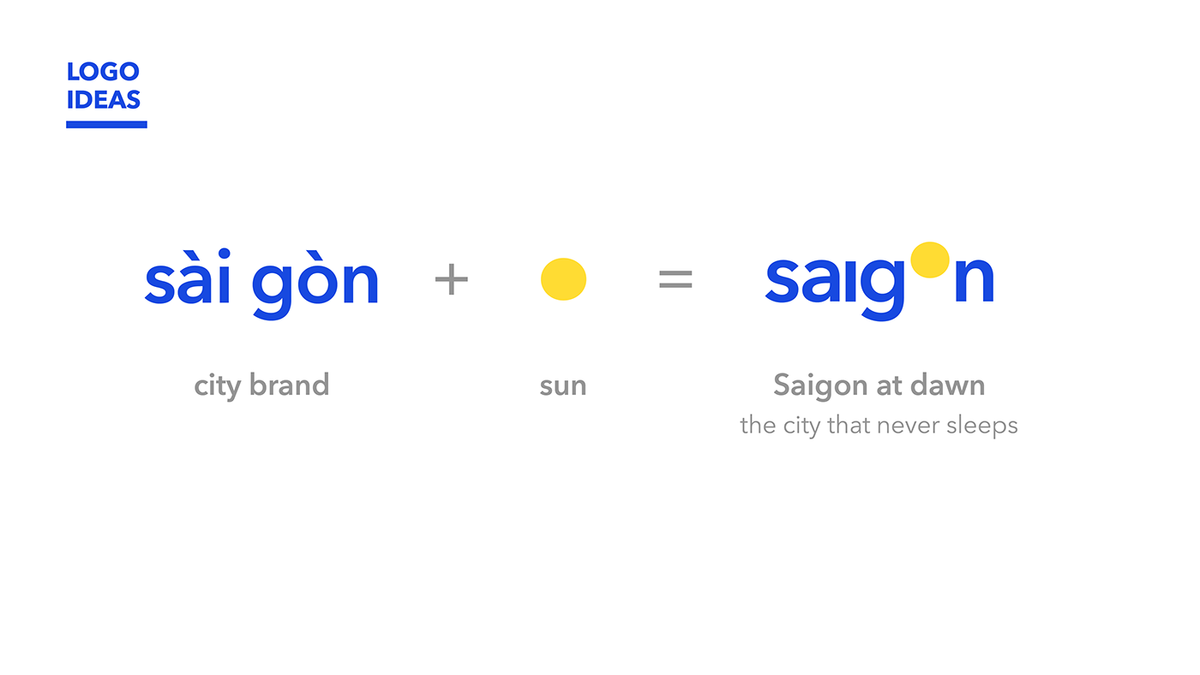
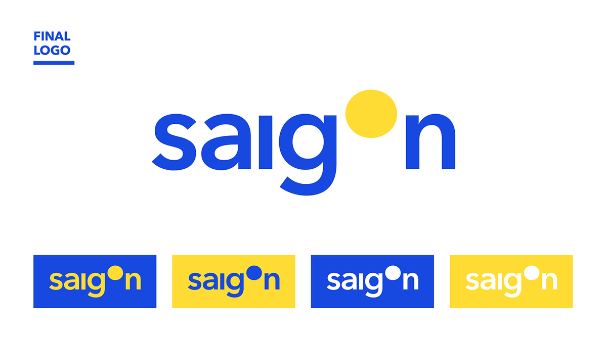
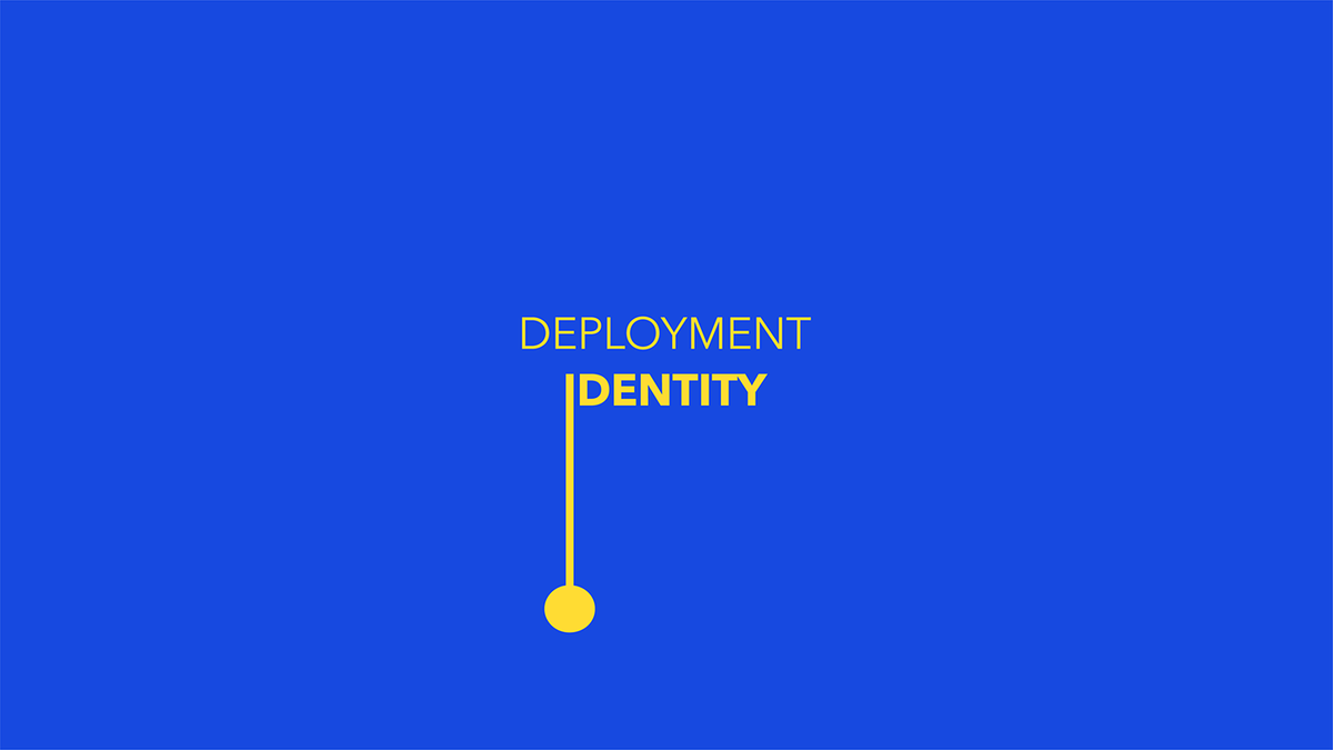
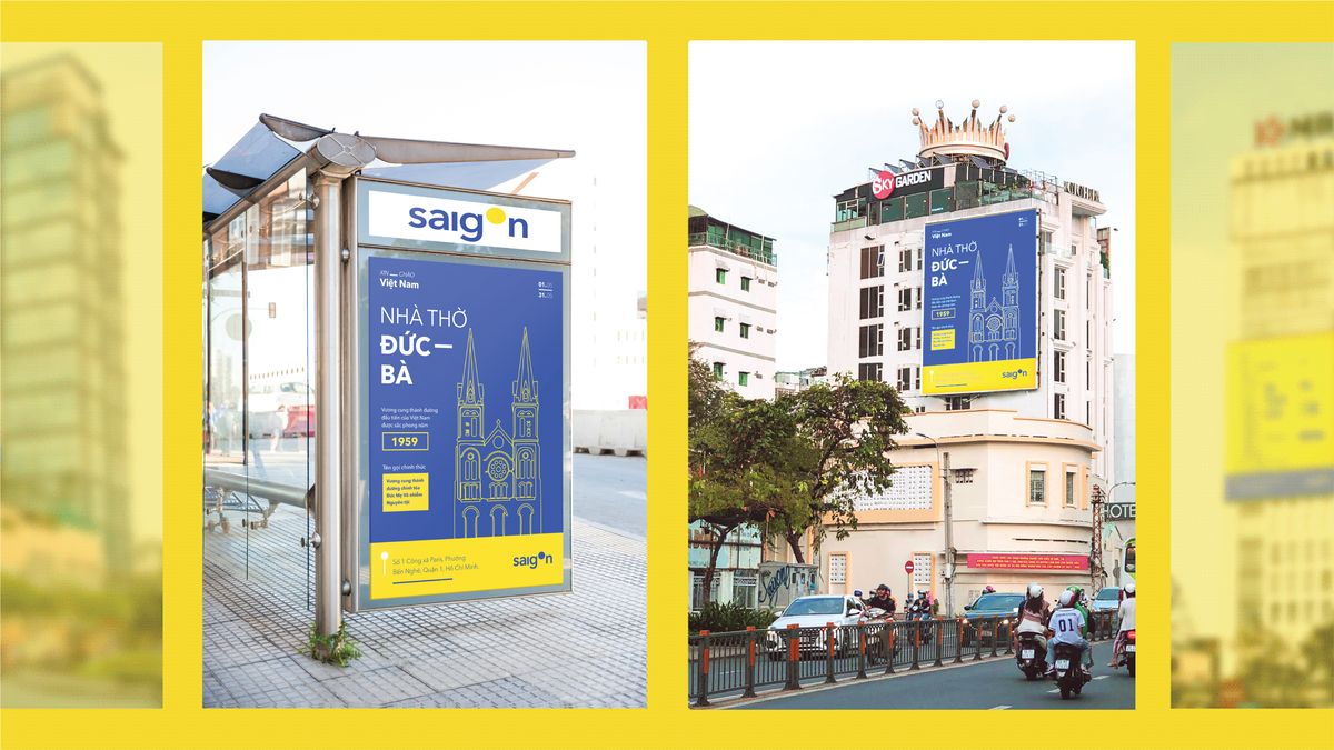
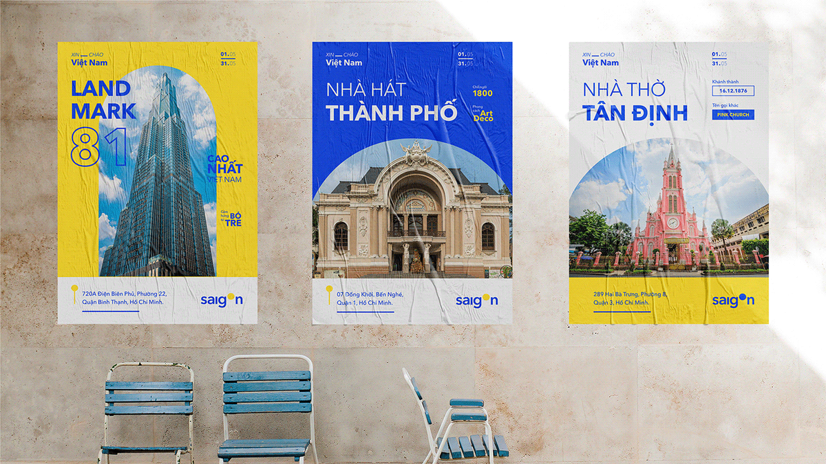
The hustle and bustle of life in Saigon city - the city that never sleeps is the story behind this tailor - made logo